In this article, we will explore various data plotting methods by using the Pandas python. We have executed all examples on the pycharm source code editor by using the matplotlib.pyplot package.
Plotting in Pandas Python
In Pandas, the .plot() has several parameters that you can use based on your needs. Mostly, using the ‘kind’ parameter, you can define which type of plot you will create.
The Syntax for Plotting Data using Pandas Python
The following syntax is used to plot a DataFrame in Pandas Python:
import pandas as pd
import matplotlib.pyplot as plt
# Prepare Data to create DataFrame
data_frame = {
'Column1': ['field1', 'field2', 'field3', 'field4',...],
‘Column2': ['field1', 'field2', 'field3', 'field4',...]
}
var_df= pd.DataFrame(data_frame, columns=['Column1', 'Column2])
print(Variable)
# plotting bar graph
var_df.plot.bar(x='Column1', y='Column2')
plt.show()
You can also define the plot kind by using the kind parameter as follows:
Pandas DataFrames objects have the following plot methods for plotting:
- Scatter Plotting: plot.scatter()
- Bar Plotting: plot.bar() , plot.barh() where h represents horizontal bars plot.
- Line Plotting: plot.line()
- Pie Plotting: plot.pie()
If a user only uses the plot() method without using any parameter then, it creates the default line graph.
We will now elaborate on some major types of plotting in detail with the help of some examples.
Scatter Plotting in Pandas
In this type of plotting, we have represented the relationship between two variables. Let’s take an example.
Example
For example, we have data of correlation between two variables GDP_growth and Oil_price. To plot the relation between two variables, we have executed the following piece of code on our source code editor:
import pandas as pd
gdp_cal= pd.DataFrame({
'GDP_growth': [6.1, 5.8, 5.7, 5.7, 5.8, 5.6, 5.5, 5.3, 5.2, 5.2],
'Oil_Price': [1500, 1520, 1525, 1523, 1515, 1540, 1545, 1560, 1555, 1565]
})
df = pd.DataFrame(gdp_cal, columns=['Oil_Price', 'GDP_growth'])
print(df)
df.plot(x='Oil_Price', y='GDP_growth', kind = 'scatter', color= 'red')
plt.show()
Line Charts Plotting in Pandas
The line chart plot is a basic type of plotting in which given information displays in a data points series that are further connected by segments of straight lines. Using the Line charts, you can also show the trends of information overtime.
Example
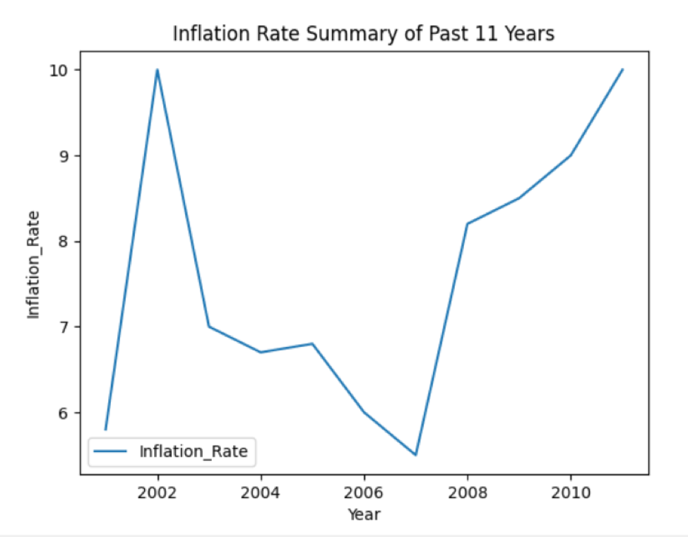
In the below-mentioned example, we have taken the data about the past year’s inflation rate. First, prepare the data and then create DataFrame. The following source code plots the line graph of the available data:
import matplotlib.pyplot as plt
infl_cal = {'Year': [2001, 2002, 2003, 2004, 2005, 2006, 2007, 2008, 2009, 2010, 2011],
'Infl_Rate': [5.8, 10, 7, 6.7, 6.8, 6, 5.5, 8.2, 8.5, 9, 10]
}
data_frame = pd.DataFrame(infl_cal, columns=['Year', 'Infl_Rate'])
data_frame.plot(x='Year', y='Infl_Rate', kind='line')
plt.show()
In the above example, you need to set the kind= ‘line’ for line chart plotting.
Method 2# Using plot.line() method
The above example, you can also implement using the following method:
import matplotlib.pyplot as plt
inf_cal = {'Year': [2001, 2002, 2003, 2004, 2005, 2006, 2007, 2008, 2009, 2010, 2011],
'Inflation_Rate': [5.8, 10, 7, 6.7, 6.8, 6, 5.5, 8.2, 8.5, 9, 10]
}
data_frame = pd.DataFrame(inf_cal, columns=['Inflation_Rate'], index=[2001, 2002, 2003, 2004, 2005, 2006, 2007, 2008, 2009, 2010, 2011])
data_frame.plot.line()
plt.title('Inflation Rate Summary of Past 11 Years')
plt.ylabel('Inflation_Rate')
plt.xlabel('Year')
plt.show()
The following line graph will display after running the above code:
Bar Chart Plotting in Pandas
The bar chart plotting is used to represent the categorical data. In this type of plot, the rectangular bars with different heights are plotted based on the given information. The bar chart can be plotted in two different horizontal or vertical directions.
Example
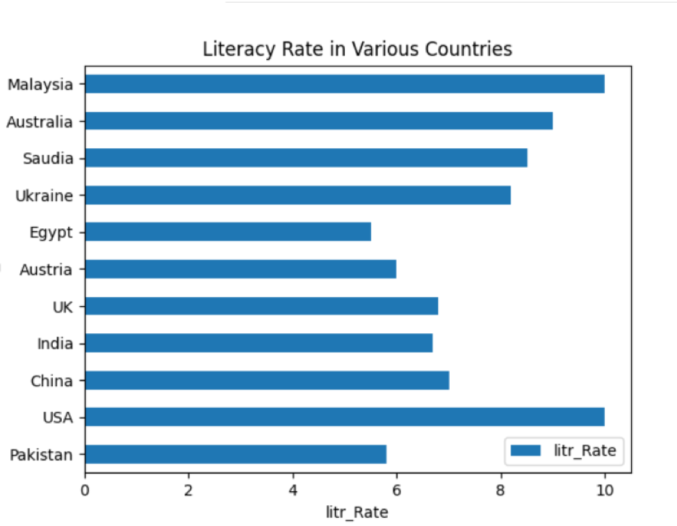
We have taken the literacy rate of several countries in the following example. DataFrames are created in which ‘Country_Names’ and ‘literacy_Rate’ are the two columns of a DataFrame. Using Pandas, you can plot the information in the bar graph shape as follows:
import matplotlib.pyplot as plt
lit_cal = {
'Country_Names': ['Pakistan', 'USA', 'China', 'India', 'UK', 'Austria', 'Egypt', 'Ukraine', 'Saudia', 'Australia',
'Malaysia'],
'litr_Rate': [5.8, 10, 7, 6.7, 6.8, 6, 5.5, 8.2, 8.5, 9, 10]
}
data_frame = pd.DataFrame(lit_cal, columns=['Country_Names', 'litr_Rate'])
print(data_frame)
data_frame.plot.bar(x='Country_Names', y='litr_Rate')
plt.show()
You can also implement the above example using the following method. Set the kind=’bar’ for bar chart plotting in this line:
plt.show()
Horizontal bar chart plotting
You can also plot the data on horizontal bars by executing the following code:
import pandas as pd
data_chart = {'litr_Rate': [5.8, 10, 7, 6.7, 6.8, 6, 5.5, 8.2, 8.5, 9, 10]}
df = pd.DataFrame(data_chart, columns=['litr_Rate'], index=['Pakistan', 'USA', 'China', 'India', 'UK', 'Austria', 'Egypt', 'Ukraine', 'Saudia', 'Australia',
'Malaysia'])
df.plot.barh()
plt.title('Literacy Rate in Various Countries')
plt.ylabel('Country_Names')
plt.xlabel('litr_Rate')
plt.show()
In df.plot.barh(), the barh is used for horizontal plotting. After running the above code, the following bar chart displays on the window:
Pie Chart Plotting in Pandas
A pie chart represents the data in a circular graphic shape in which data displays into slices based on the given quantity.
Example
In the following example, we have displayed the information about ‘Earth_material’ in different slices on the Pie chart. First, create the DataFrame, then, by using the pandas, display all details on the graph.
import matplotlib.pyplot as plt
material_per = {'Earth_Part': [71,18,7,4]}
dataframe = pd.DataFrame(material_per,columns=['Earth_Part'],index = ['Water','Mineral','Sand','Metals'])
dataframe.plot.pie(y='Earth_Part',figsize=(7, 7),autopct='%1.1f%%', startangle=90)
plt.show()
The above source code plots the pie graph of the available data:
Conclusion
In this article, you have seen how to plot DataFrames in Pandas python. Different kinds of plotting are performed in the above article. To plot more kinds such as box, hexbin, hist, kde, density, area, etc., you can use the same source code just by changing the plot kind.


